Hypothesis 01
Finding the right product
Supported in the interviews and task observations.
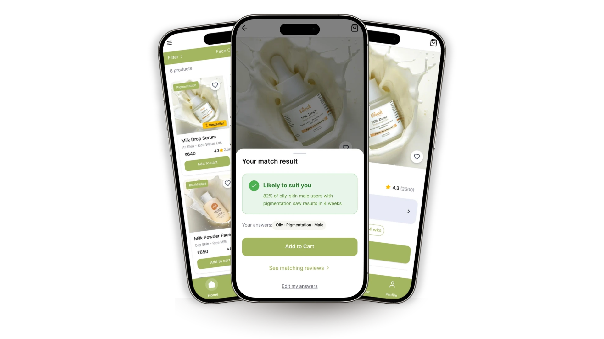
A mobile shopping redesign that helps people judge whether a product fits their needs—through clearer product cues, a guided suitability check, and reviews from people like them.
01 / Overview
After using Vilvah’s products for almost two years, I wanted the shopping experience to offer the same care. Finding a product was only part of the problem. Shoppers also needed to understand its ingredients, whether it addressed their concerns, and whose reviews to trust.
The design question
How might we help skincare shoppers identify products that match their needs, so they can choose with confidence?
02 / The research
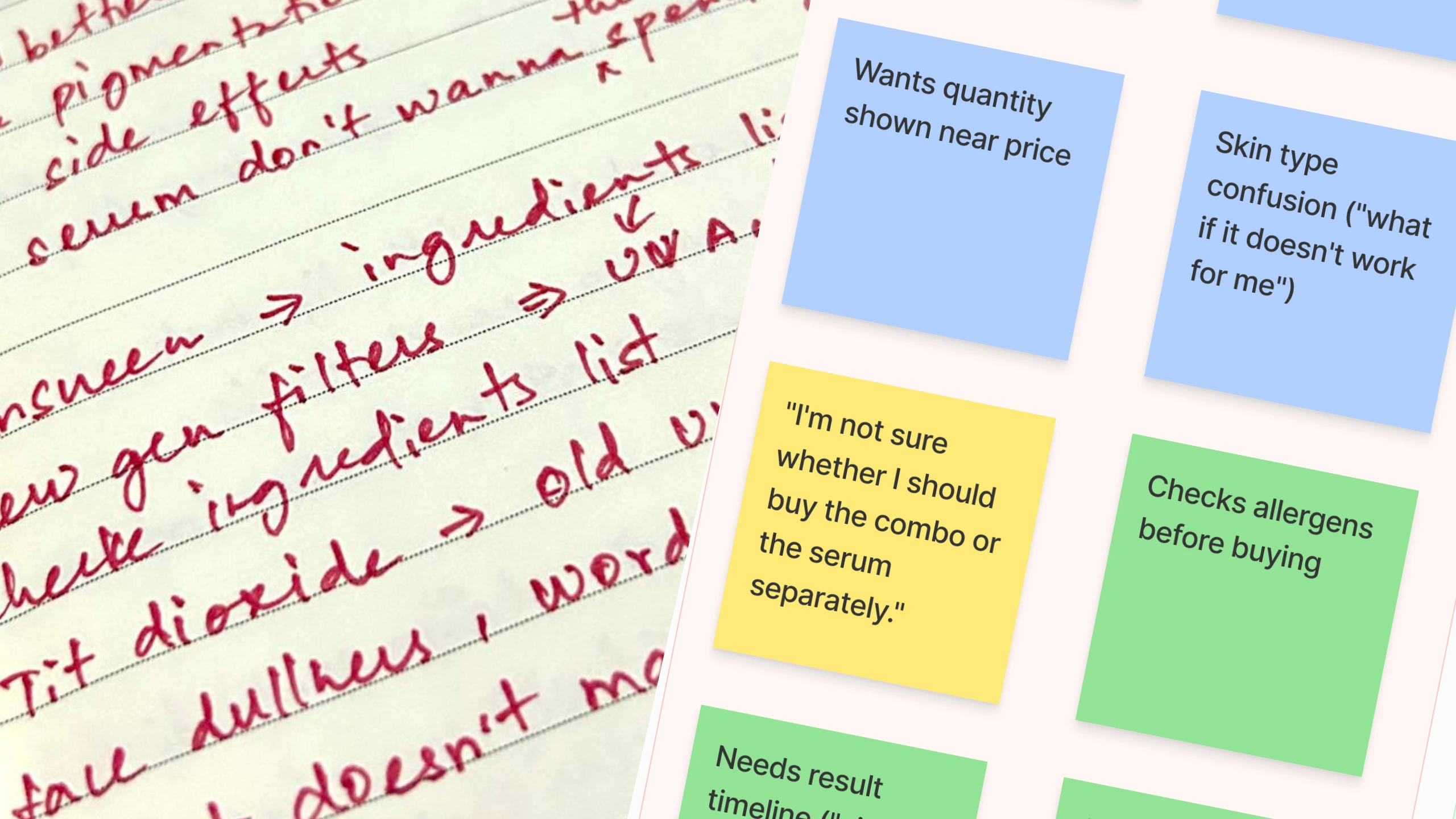
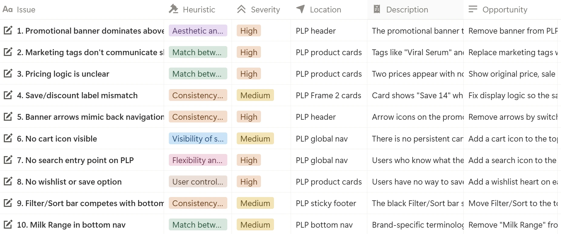
I audited the product listing page against Nielsen’s ten usability heuristics, identifying ten issues across six principles. I grouped them into three hypotheses, then interviewed five people and observed tasks in the Vilvah app over WhatsApp video calls.
Hypothesis 01
Supported in the interviews and task observations.
Hypothesis 02
Supported in the interviews and task observations.
Hypothesis 03
Not established by this round of research.
“I've never used skincare before, so I'm not sure which product to start with.”
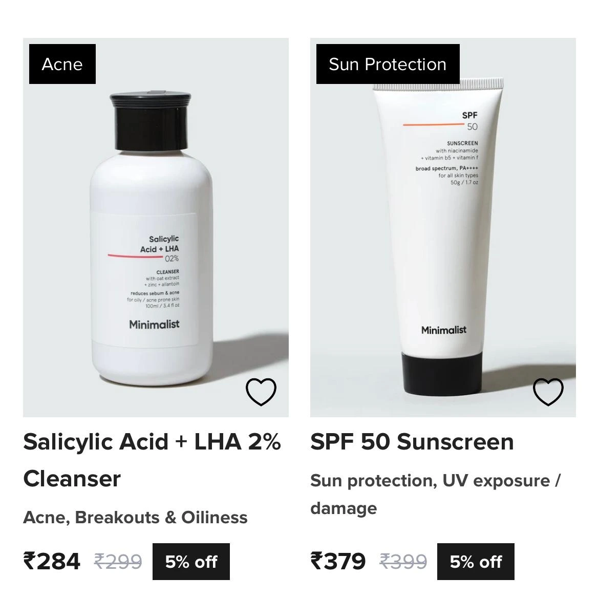
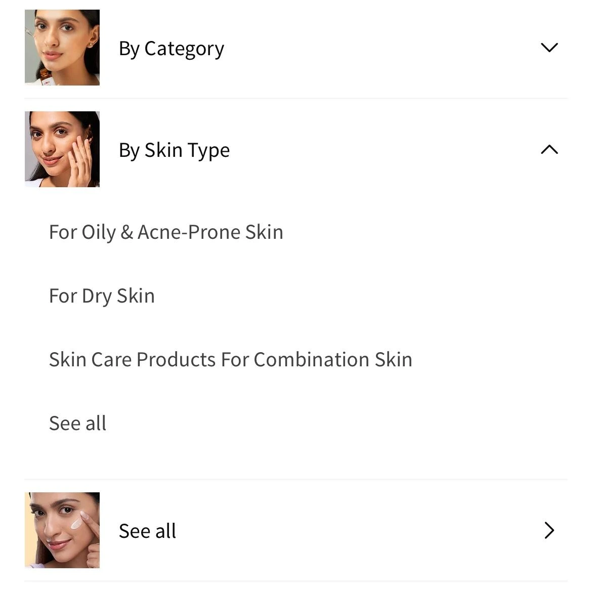
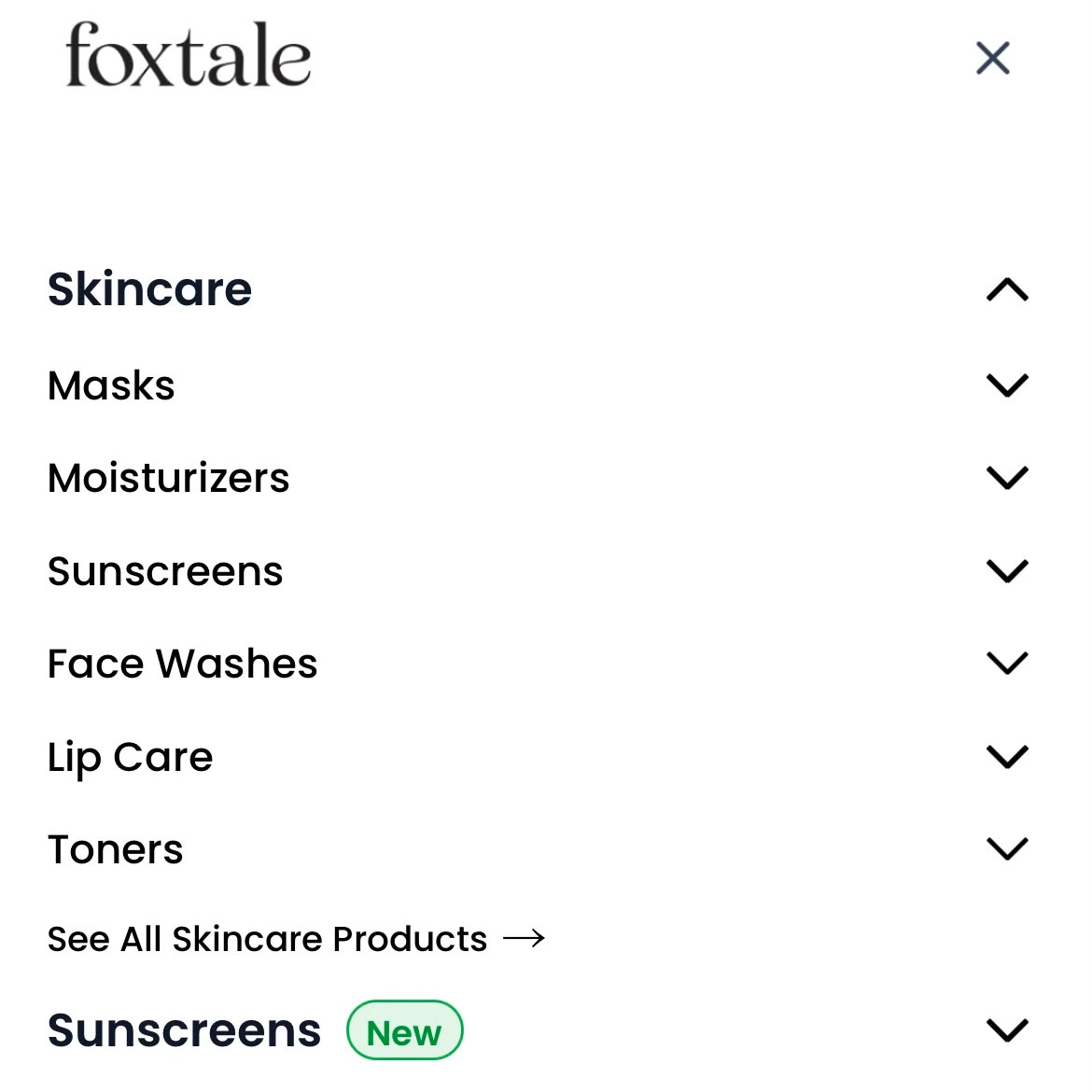
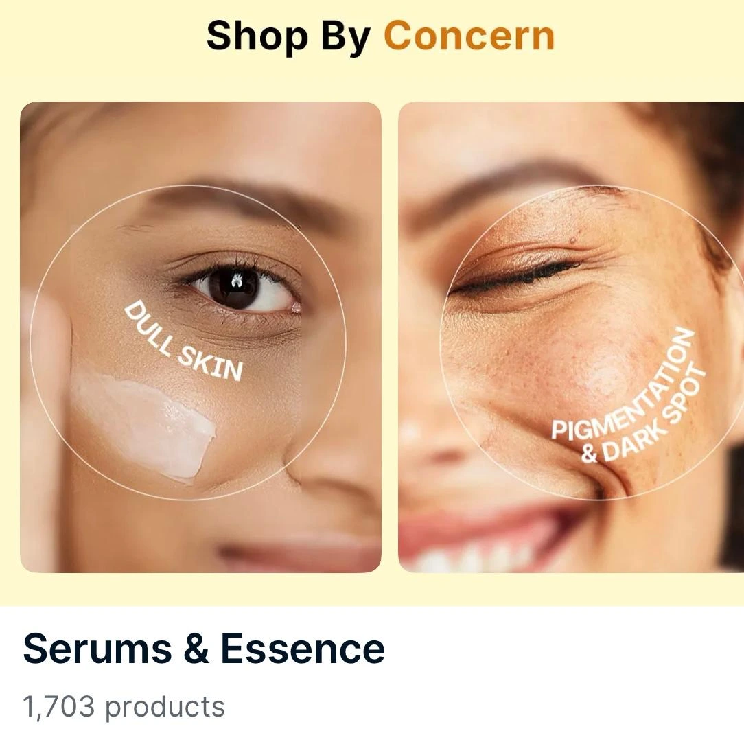
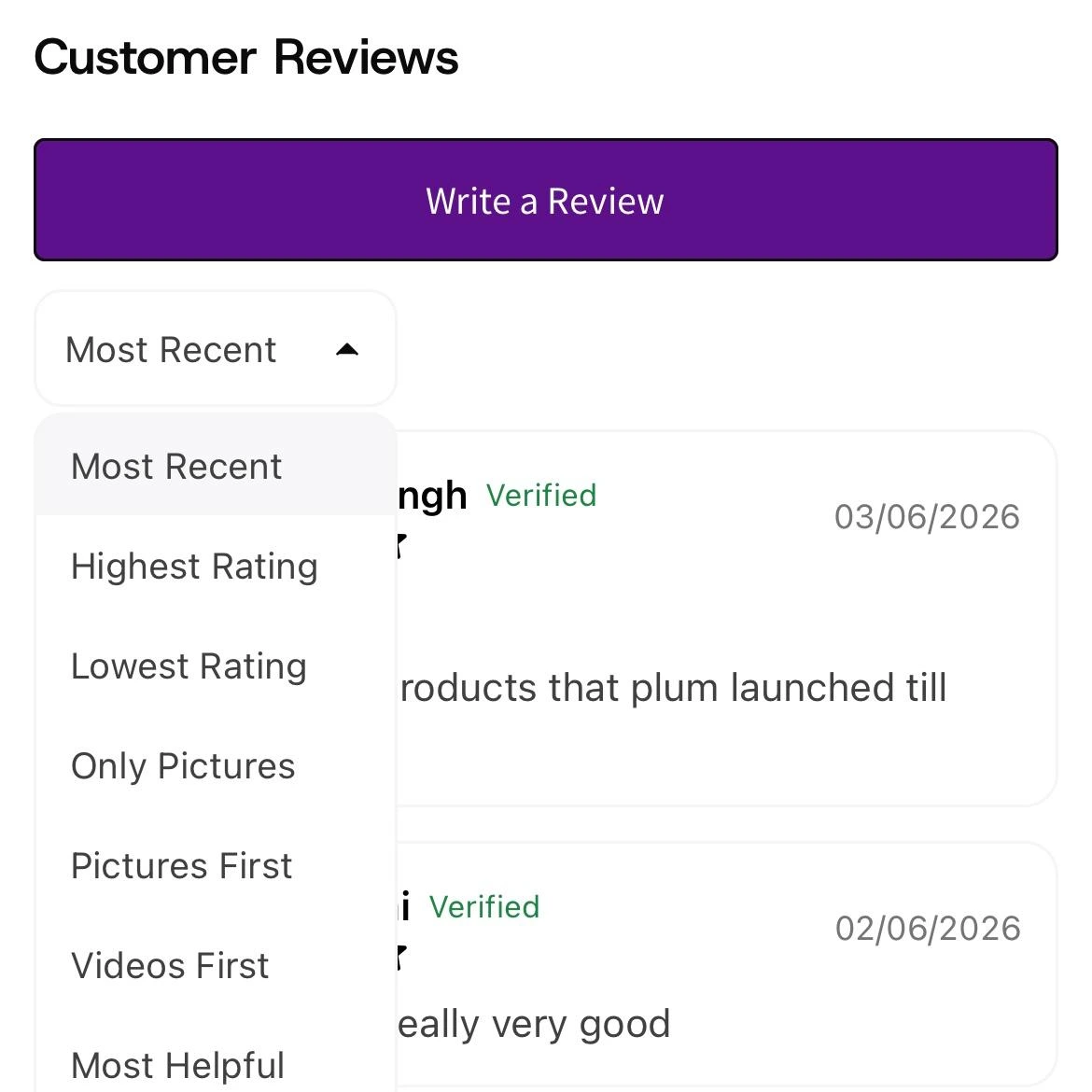
I reviewed Minimalist, Plum, and Foxtale, with Nykaa as a retail reference. Concern-based discovery and richer review tools informed the opportunities I explored.
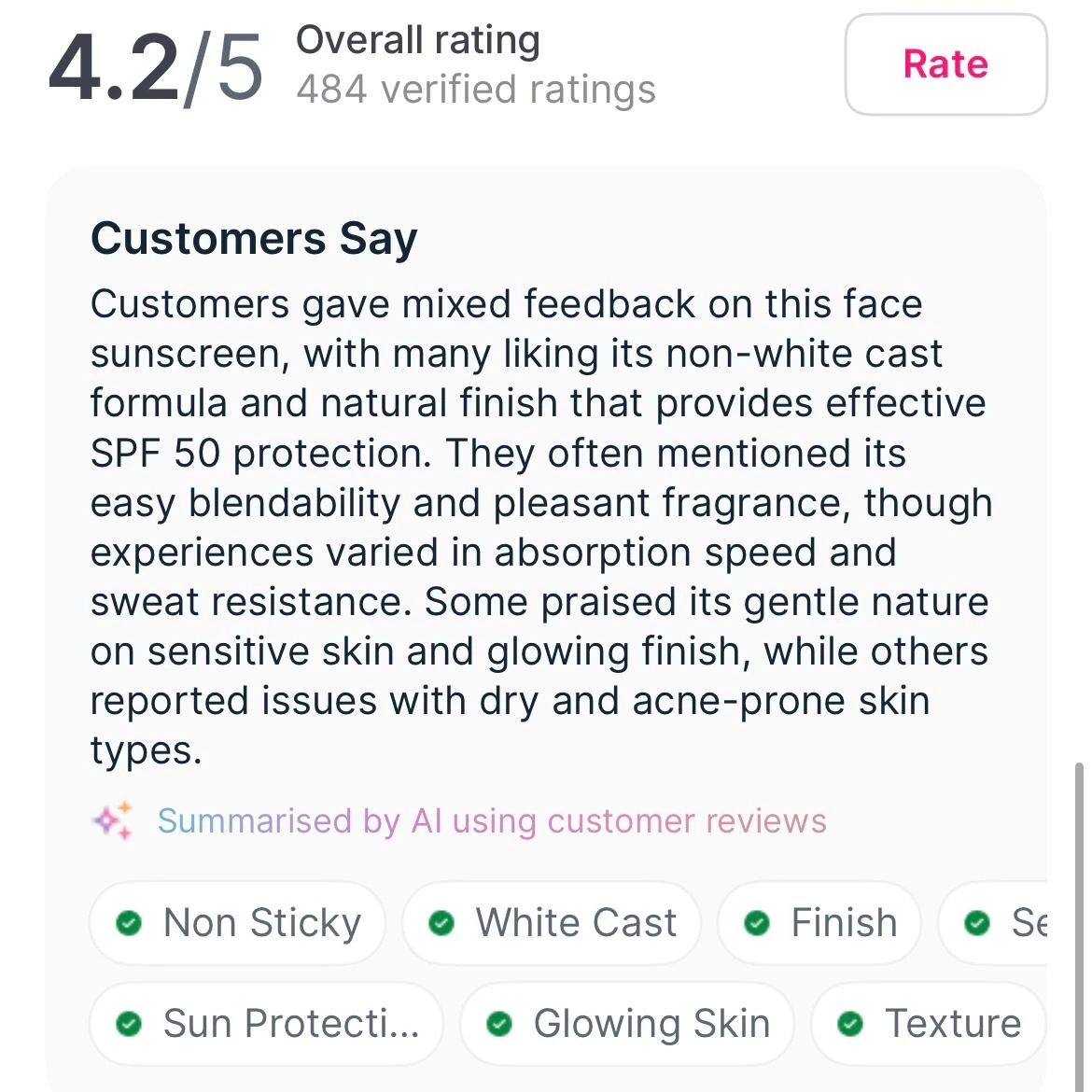
03 / Design decisions
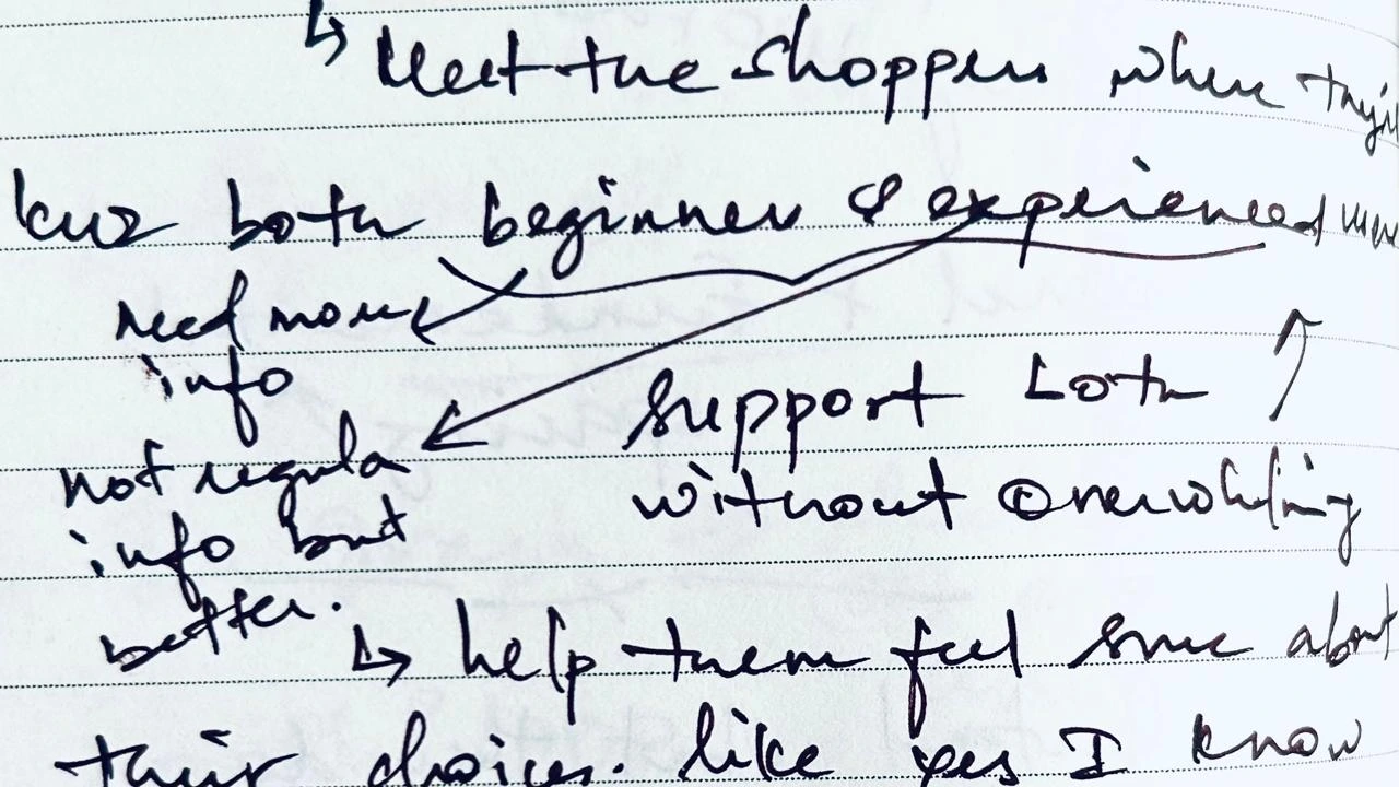
Beginners needed guidance. Experienced shoppers looked for ingredients, value, and credible reviews. I focused the redesign on the information each person needed to make their own decision.
01 / From finding to design
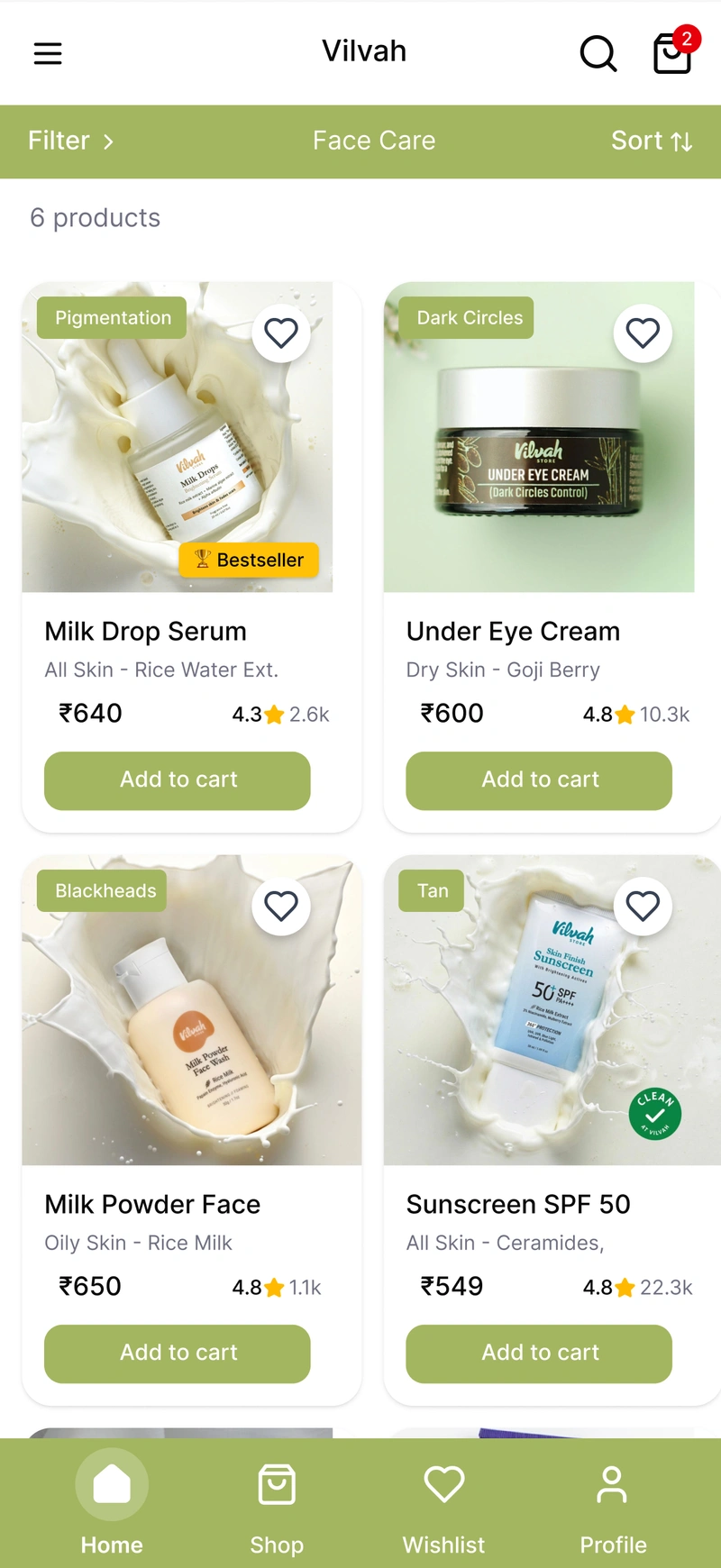
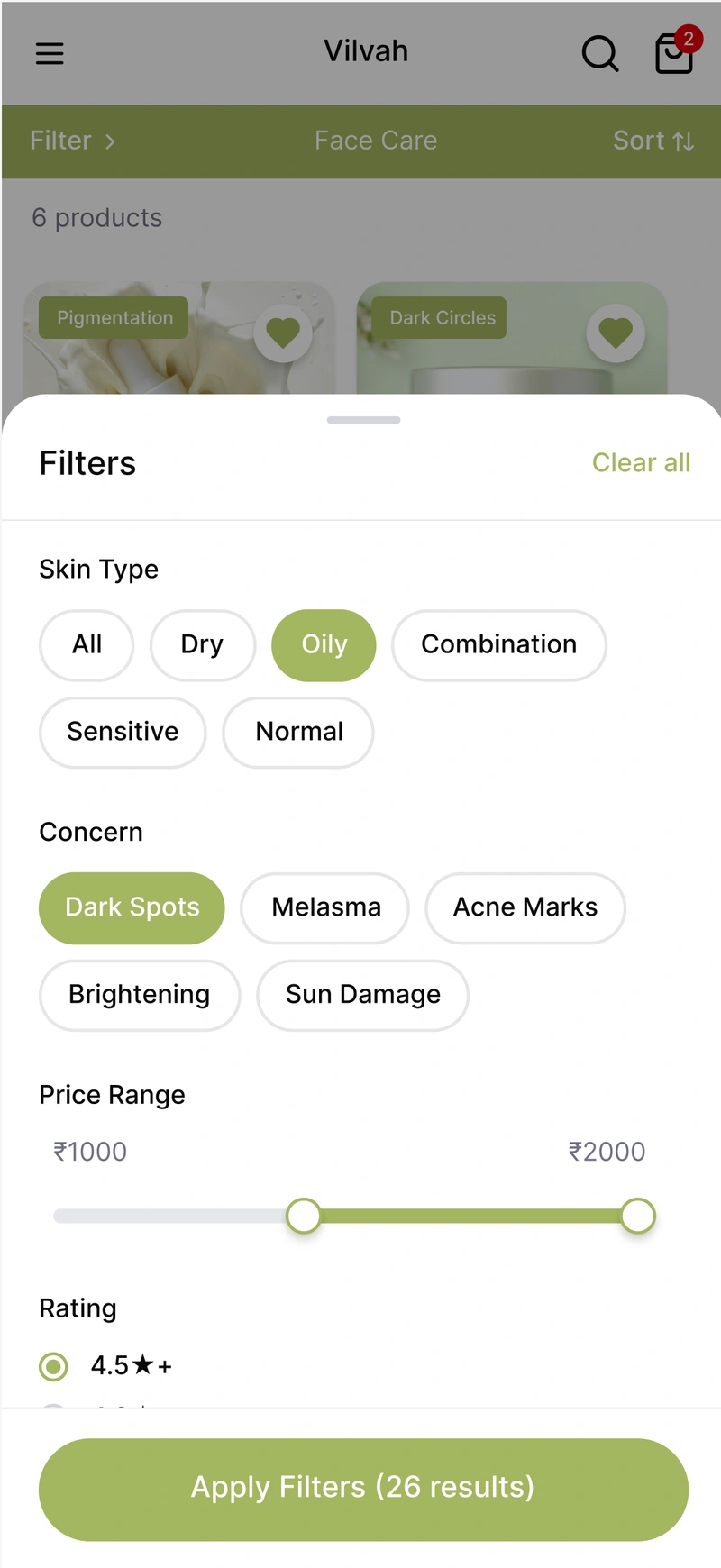
02 / From finding to design
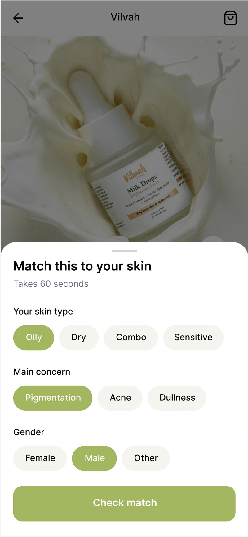
03 / From finding to design
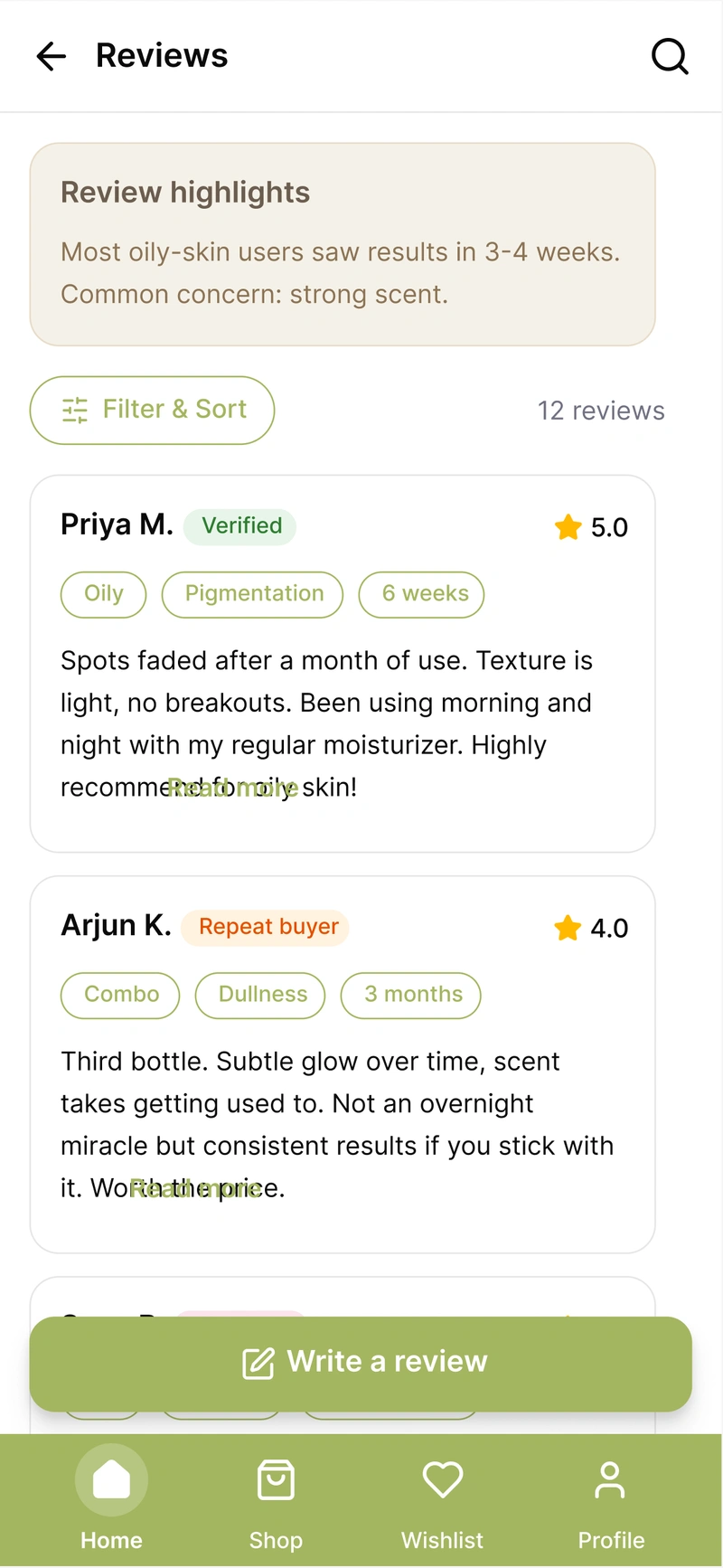
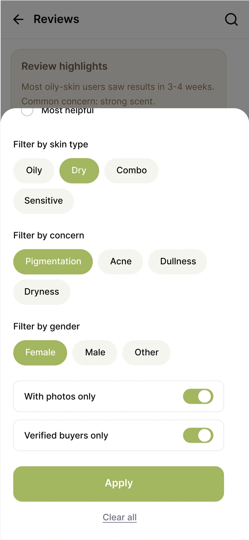
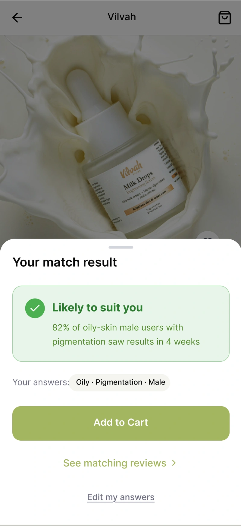
Close-ups from the supplied redesign. Match percentages, review counts, and product-result claims shown in these mockups are prototype content; the study evaluated the shopping experience, not skincare effectiveness.
04 / The redesign
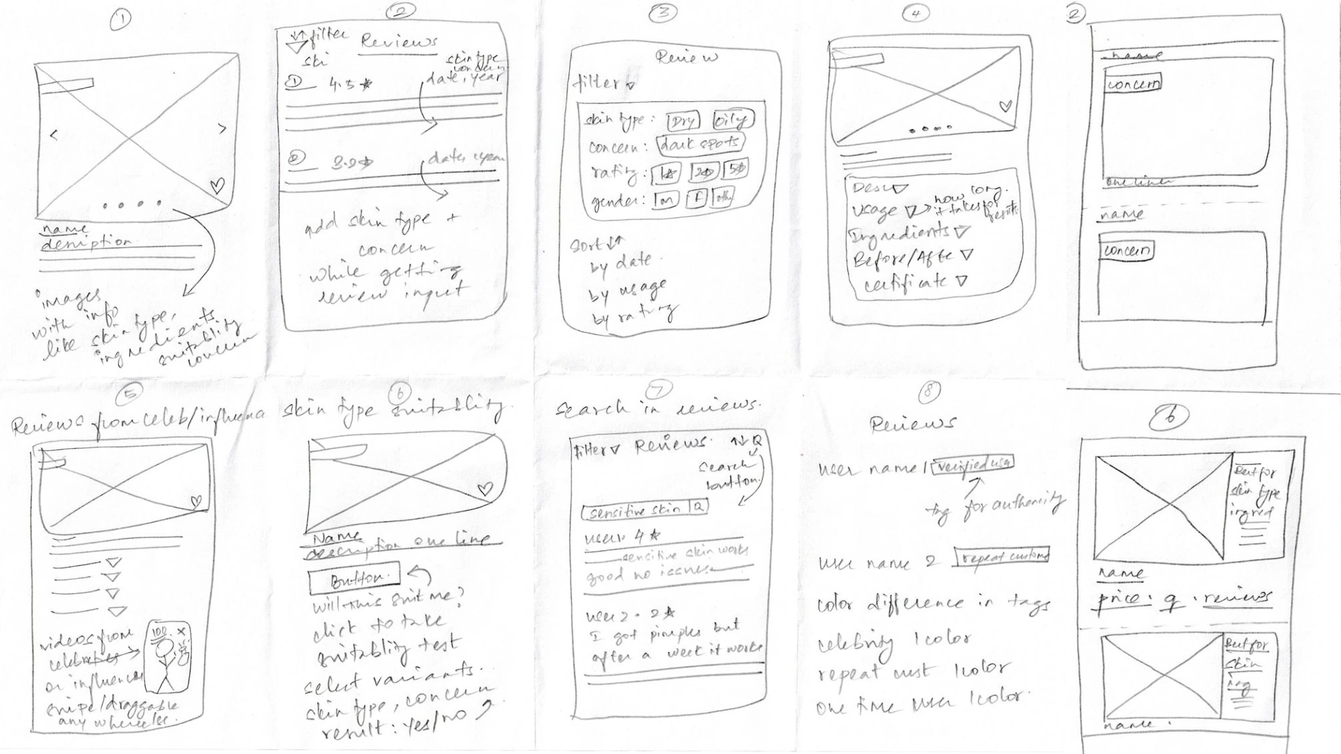
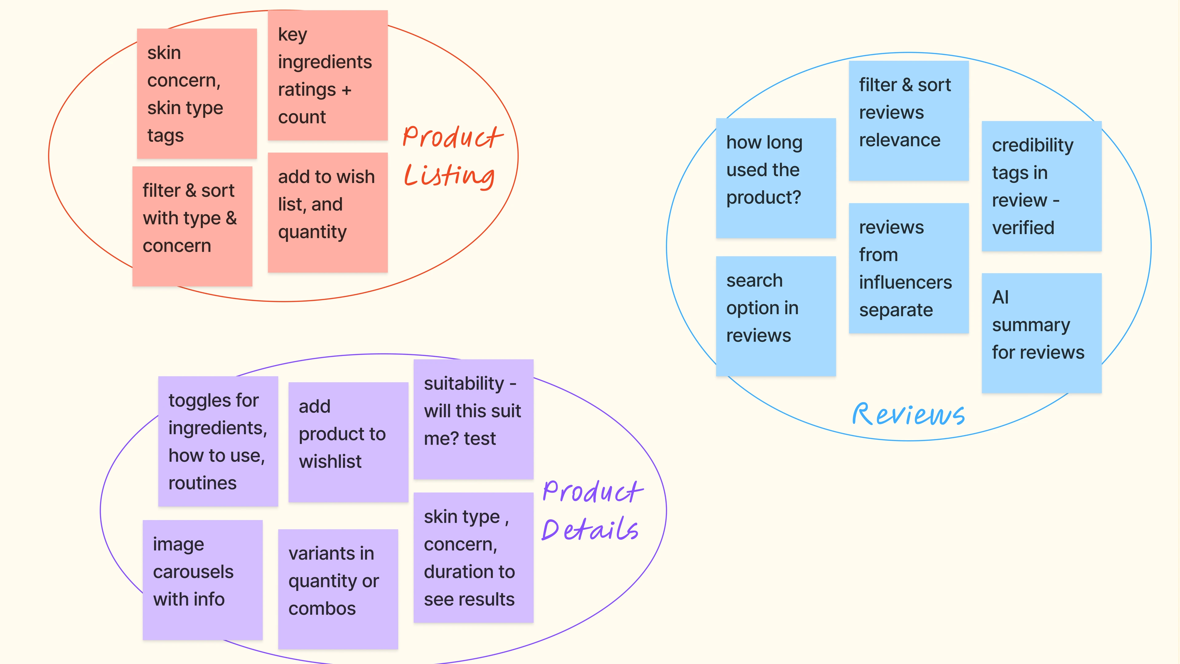
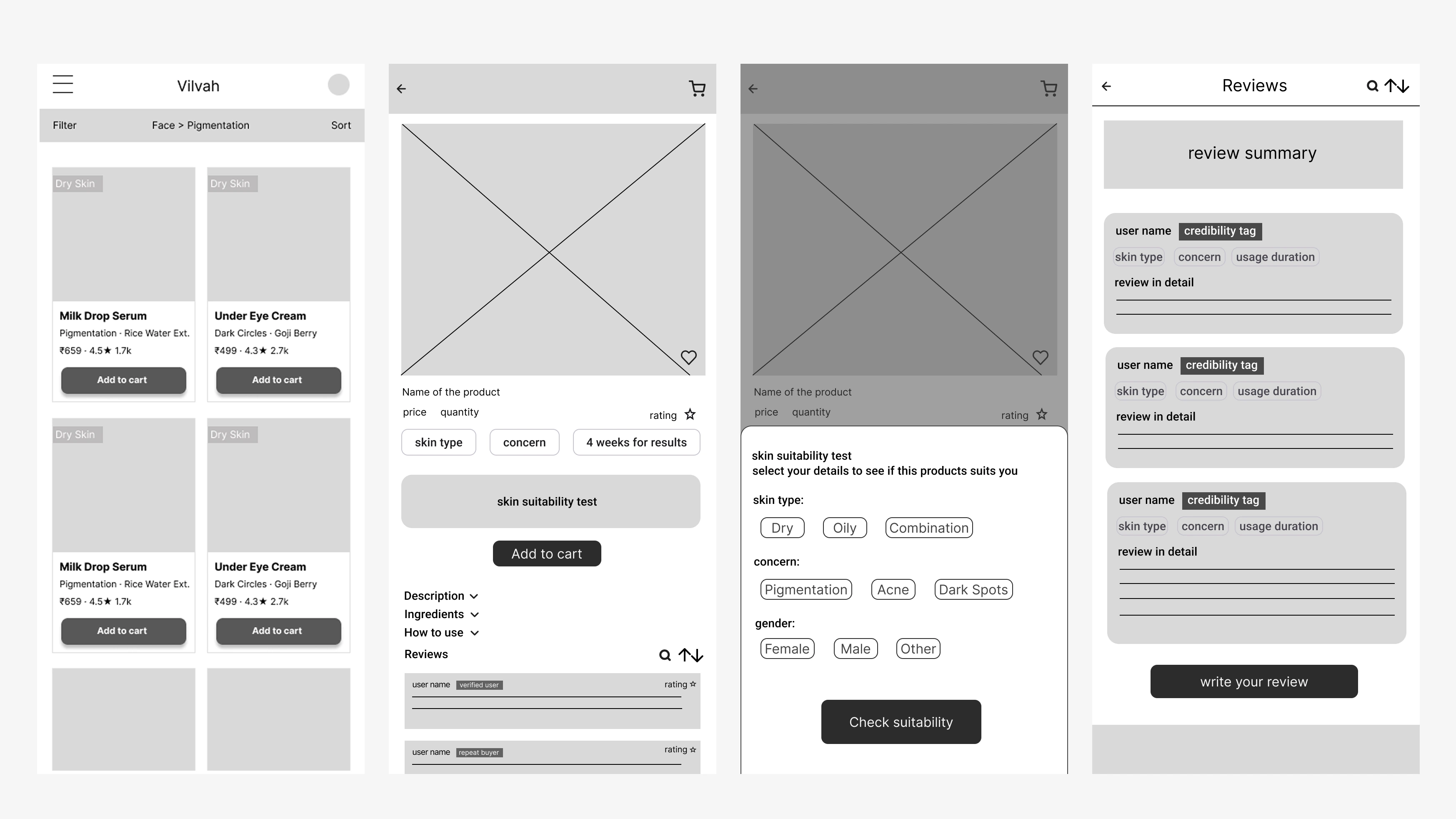
I moved from pain-point mapping and Crazy 8s to grouped concepts, wireframes, and the final screens. A working Figma Make prototype, deployed on Vercel, let participants try the flow rather than review static images.
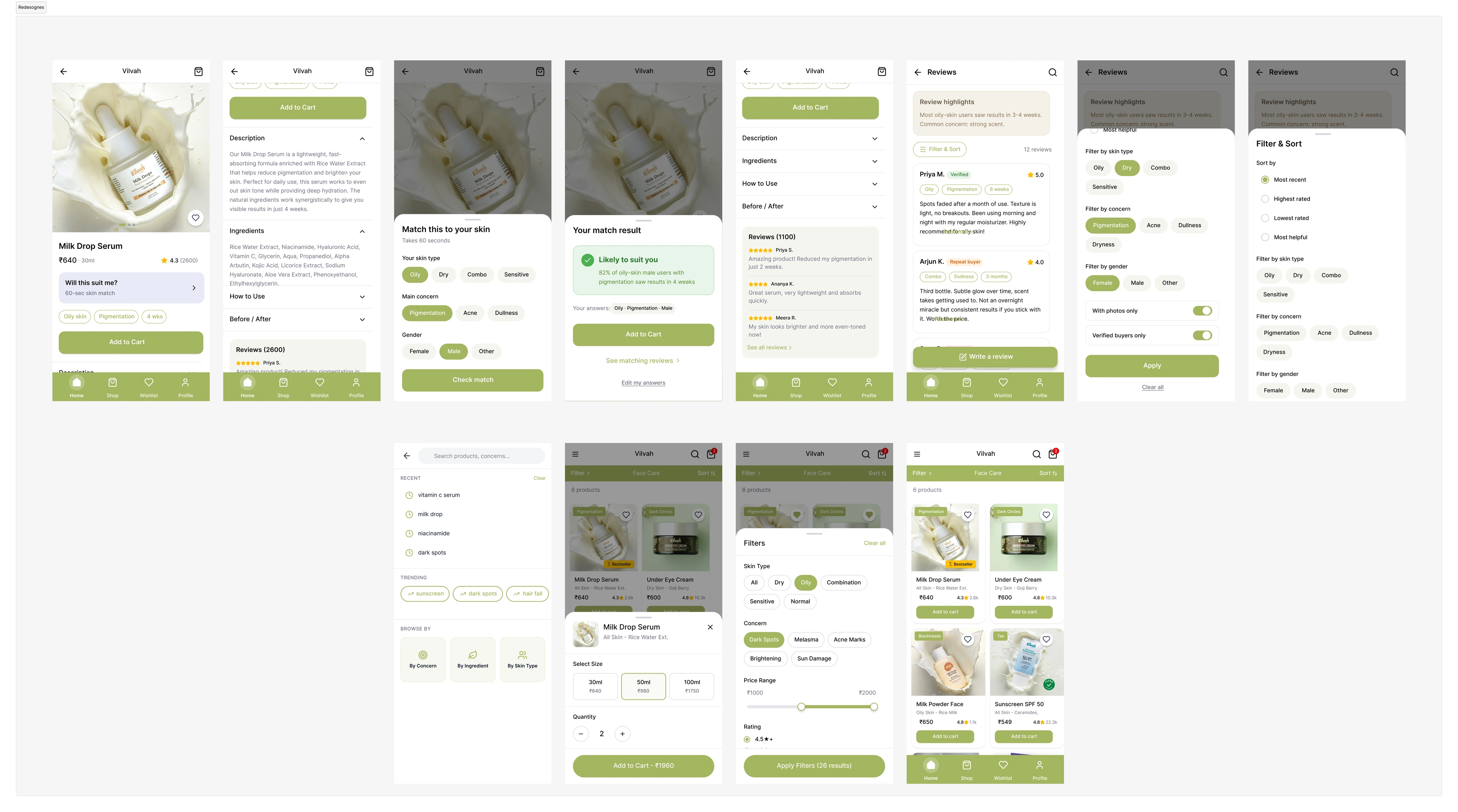
The walkthrough follows Alex, a 25-year-old with dry skin and pigmentation, evaluating Milk Drops Serum. He uses “Will This Suit Me?”, checks reviews from similar profiles, and adds the product to his cart. This is a demonstration scenario in the prototype.
05 / Testing & iteration
I tested the prototype with five skincare buyers, asking them to find a product for their concern, evaluate its suitability, and add it to cart. All five evaluated the product; four added it. The fifth preferred to wait for an offer price.
Observed or reported in five prototype sessions. These counts describe this small study; they are not live sales, a conversion lift, or a comparison with the original app.
“Reviews are my main deciding factor. It's helpful when I can search within reviews like pimples, and see how it worked for people with oily skin.”
Next iteration
Improve the visibility of filters on the product listing page, following feedback from testing.
Next iteration
Surface pricing and discount information more clearly. Understanding a product’s relevance did not remove the fifth participant’s wish to wait for an offer.
06 / Reflection
This project taught me to start with something I could test, listen to the different ways people shop, and keep refining what helps them decide. A useful experience does not need endless additions—it needs the right information at the right moment.
Confidence came from context: what the product addresses, who it might be relevant to, and what similar shoppers had experienced.